DISH Wireless · Telecom
Boost Infinite: turning more visits into completed purchases
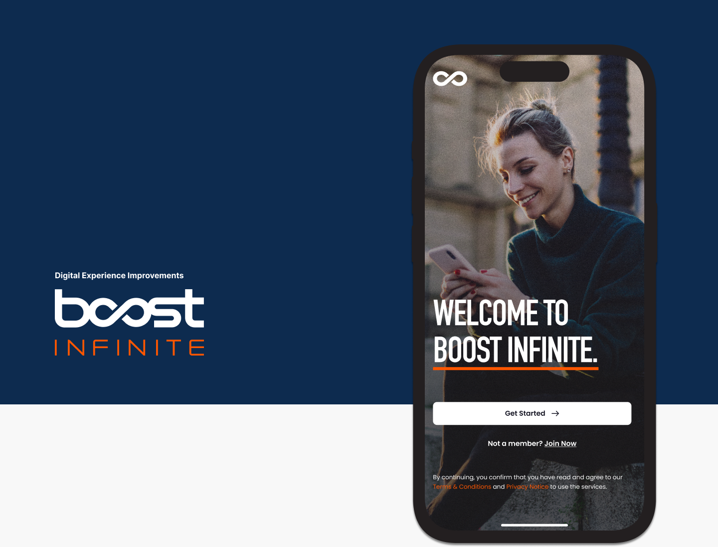
Boost Infinite is the postpaid wireless brand of DISH Wireless. As UX manager, I led research and design across the shopping and purchase journey against three business goals: more quality visits, fewer abandoned credit checks and more completed purchases.
My role
UX Manager
Team
Product designers, UX researchers, product and analytics partners
Timeline
2023
Outcome
+28% purchase completion
01 · Context
The challenge
Improve the share of quality visits
The site wasn’t guiding customers to the most relevant information. Quality visits (2+ pageviews) went from 13.44% to 19.43% against a 16% target, and quality visits that added to cart went from 47.01% to 66.68% against a 50% target.
Reduce abandonment during the credit check
A high share of carts were abandoned at the credit check. Carts completing the check went from 34.05% to 42.94% against a 40% target, and users passing and completing purchase on the $60 plan went from 28.54% to 35.52% against a 32% target.
Complete more purchases
The $25 plan had a significant drop-off between adding to cart and completing purchase. Completion went from 4.10% to 6.29% against a 4.50% target.
02 · Research
How we learned
We worked in 2-week sprints with research and design sharing responsibility. Stakeholder interviews shaped the backlog, and a set of analytics and testing tools kept us close to real behavior.
Quantum Metric
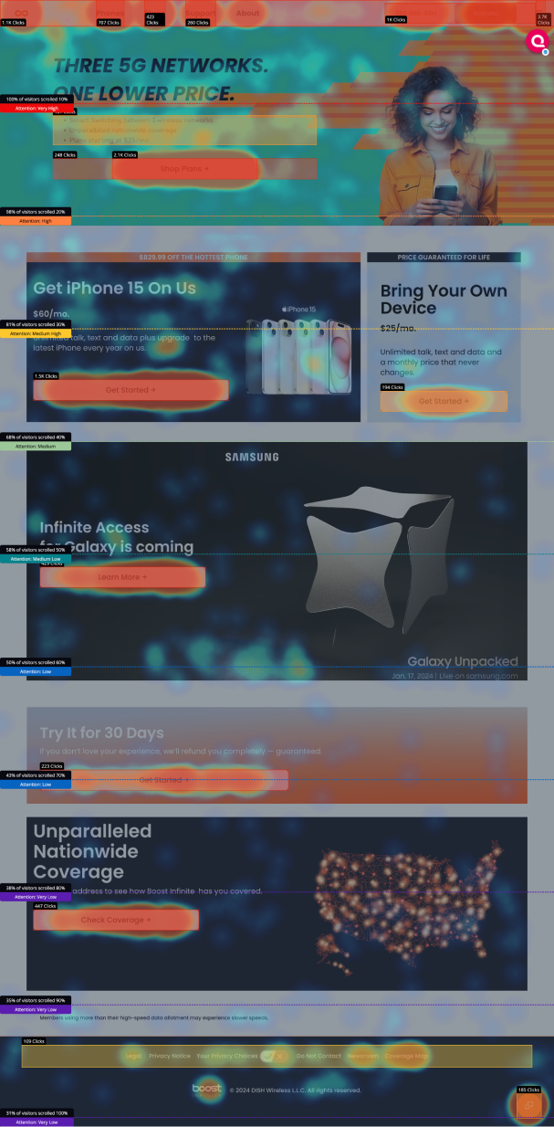
Session replays, heatmaps and journey mapping to find pain points
Adobe and Google Analytics
Funnel analysis and segmentation to prioritize ideas
Adobe Target
A/B tests and feature flags to validate solutions
We paired that data with user interviews, card sorting, first impression testing, tree testing, surveys, usability testing and competitive analysis.
03 · Design
What we built and why
Our work was grounded in the Infinite Design System, built on IBM’s Carbon. For each goal we restructured the information hierarchy, rewrote content in plain language and simplified the layout.
Quality visits
We rebuilt the information architecture around discoverability, made UX language clear and consistent, and rebalanced the visual design. Orders rose 16%.
Credit check
We added a prominent credit check badge so people knew the impact up front, rewrote the content, restructured the flow and cut page load times.
Purchase
We restructured navigation and content hierarchy, redesigned the layout to guide people through checkout, and simplified the language. Purchase completion rose 28%.
04 · Results
The impact
+28%
purchase completion rate
+16%
orders after the quality visit work
6.29%
$25 plan completion, up from 4.10%